NatWest & Royal Bank of Scotland Launch New Brand Identities Created by FutureBrand
26 September, 2016 Share socially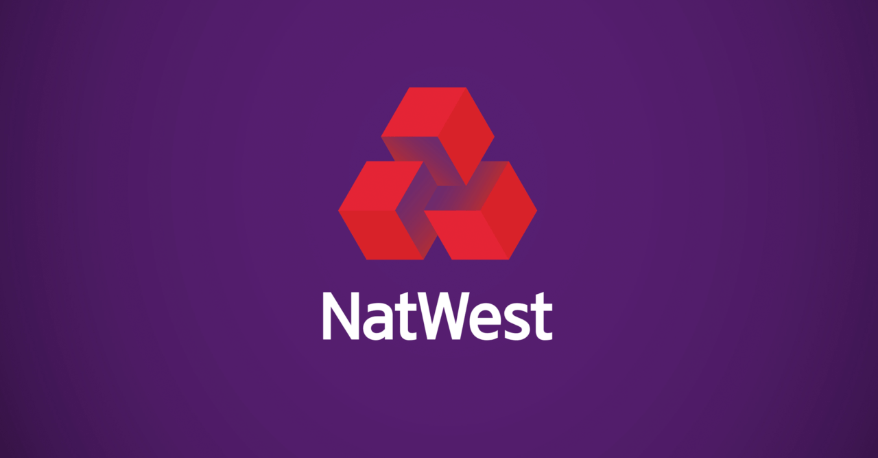
NatWest
Our mission was to involve customers and staff in the brand by creating a brand language that is engaging, unique and stands out both online and on the visually ‘noisy’ high street. Instantly memorable and recognisable, the new identity is certain to ensure stand out from the competition.
Creatively, NatWest has never been scared of going against the grain, proven by the original 3D logo we found in their 1968 guidelines – buried deep in the RBS archives. Originally designed as three interlocking cubes to represent the coming together of three separate banks, we’re now unlocking the power of the individual cube as one of the core visual assets. Demonstrative, animated and colourful, it’s the perfect vehicle to show the bank’s proactive personality.
From a humble cube we’ve literally got the building blocks to tell all manner of compelling stories. Our visual identity uses this simple idea to illustrate almost anything imaginable – to build a unique world for its customers.
Royal Bank of Scotland
In parallel, it is also a new era for the Royal Bank of Scotland – a customer brand that now has the opportunity to prepare for the next chapter in its ongoing, 300-year history.
Our dynamic new brand is an expression of modern heritage. At its core is an analysis of traditional Scottish fabrics - tweeds and tartans. We used this research to generate a distinctive and ownable brand pattern: ‘The Royal Bank tweel’ is a subtle nod to it Scottish heritage that runs through all brand communications.
Today’s Royal Bank is taking banking back to where it belongs – proudly Scottish and with customers at its heart, just like they have been since 1727.
By putting the people of Scotland at the heart of the brand and by capturing the honesty of their individual, everyday lives, their heritage, their passions and their aspirations, we can best reflect the future of today’s Scotland; warm, optimistic and smart.