From the archives: Synchronizing the World of Commerce for UPS
18 November, 2019 Share socially
Recognized as a global leader in package delivery, UPS had significantly expanded its capabilities to provide customers a variety of new and innovative services ranging from supply chain management to financial and retail services. We partnered with them in 2003 to transform the brand by defining a new era of “synchronized commerce” where the flow of goods, information and funds were seamlessly connected to benefit UPS customers worldwide.
We focused on aligning their purpose and brand experience by identifying the strategic opportunity and reflecting UPS’ global reach and expanded capabilities through a coherent new brand identity system. One of the strategic underpinnings of the program was to implement a “one UPS” approach to branding whereby the enterprise presented itself as integrated company in support of its new vision.
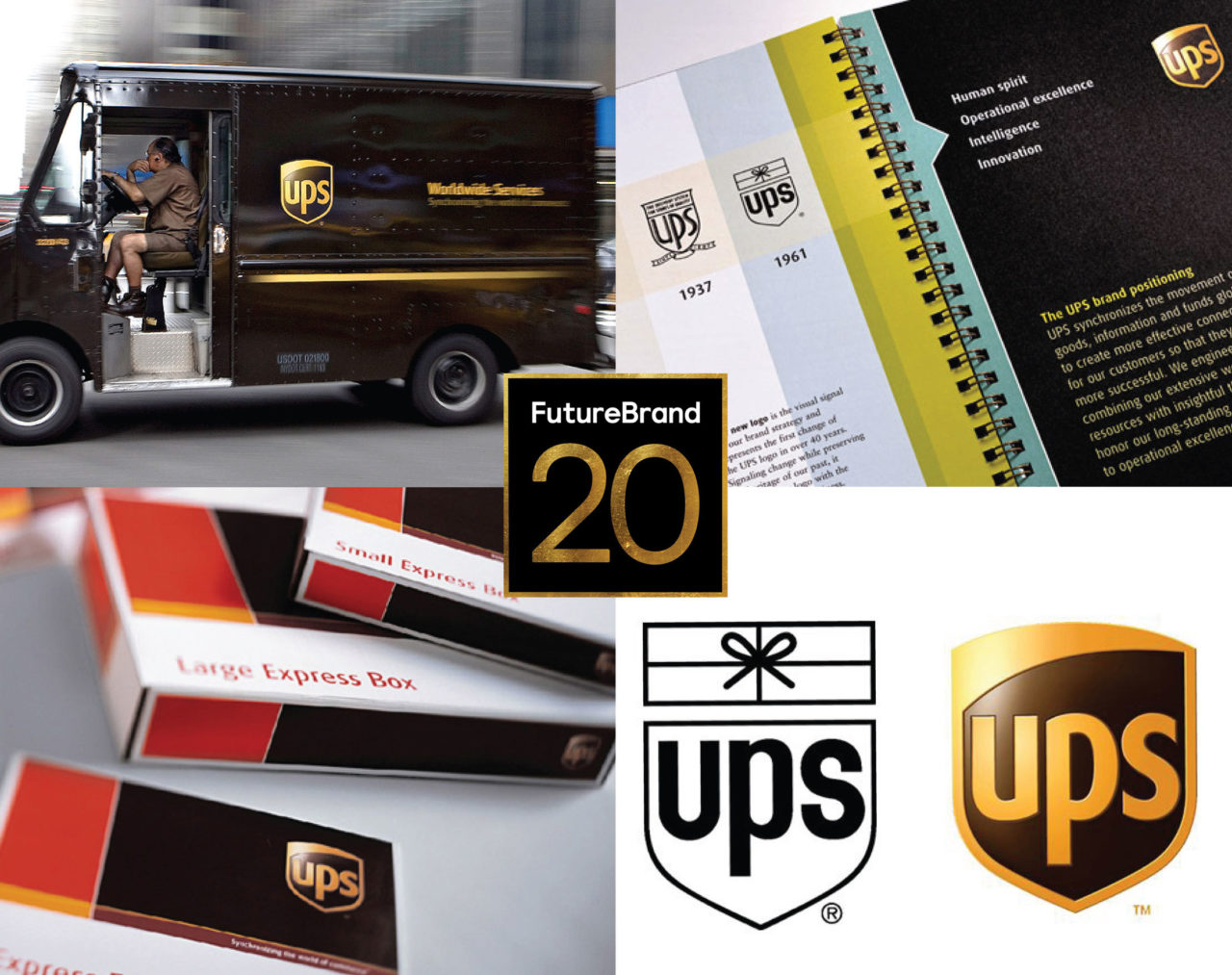
The three-dimensional UPS brandmark was designed to signal change while preserving the company’s proud heritage. Retaining the UPS shield and replacing the package with a simplified, dynamic curve expressed the evolution of the company’s services and its commitment to leading the future of global commerce. The new brandmark was the cornerstone of a comprehensive visual identity system that included a proprietary typeface and a new colour palette, designed to complement and energise the company’s signature colour, brown, for nearly 100 years.
The new identity system was implemented across the full range of UPS touchpoints including the company’s expansive fleet of vehicles, aircraft, packaging and entire print literature system. Furthermore we assisted UPS with the planning, design and production of launch materials, and comprehensive online brand guidelines.
#FutureBrand20


