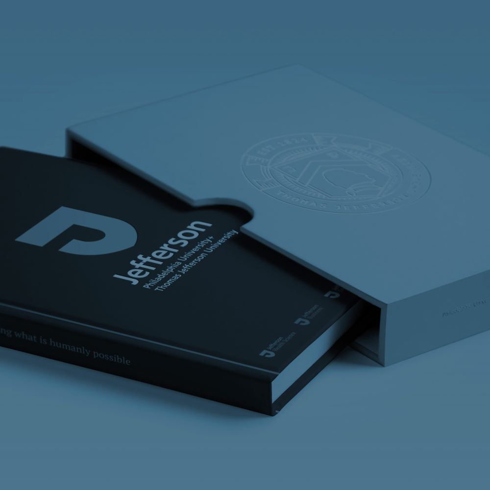
Libraries Without Borders
Shedding the light on Bibliothèques Sans Frontière’s actions
更多详细信息
向这走,走更远
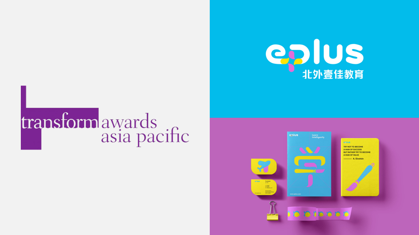
E PLUS is a leading provider of educational services in China, specializing in practical conversational English and diversity education for Chinese pupils. In the field of Chinese marketing for educational services, E PLUS wanted their brand to communicate the quality of services and position as a modern, progressive leader in the category.
FutureBrand works closely with E brand to develop a brand new strategy, brand identity system and responsive brand experience.
Together, we created a new master brand that encapsulated the E PLUS values and experience, while providing sufficient flexibility through the visual identity system that communicated the unique characteristics of its sub-brands. This allows the brand to connect with its different audiences, with relevance.
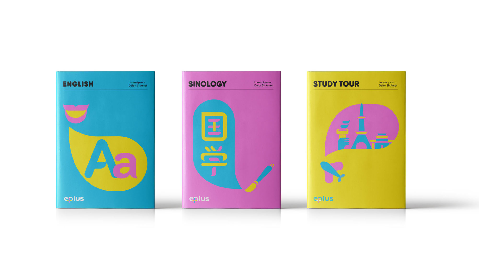
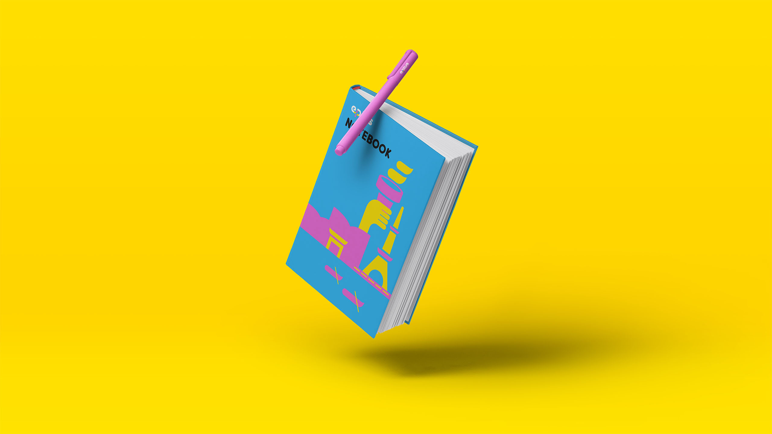
The logo incorporated design elements that were unique to the sub-brands – English, Sinology and Study Tour – while remaining instantly recognisable and integrated in its own right.
It also had to incorporate visual elements from the Beijing Foreign Studies University and thus effectively bridging notions of both the local and the global – a modern brand with an international perspective, dedicated to educating children in China, and acutely aware of their needs.
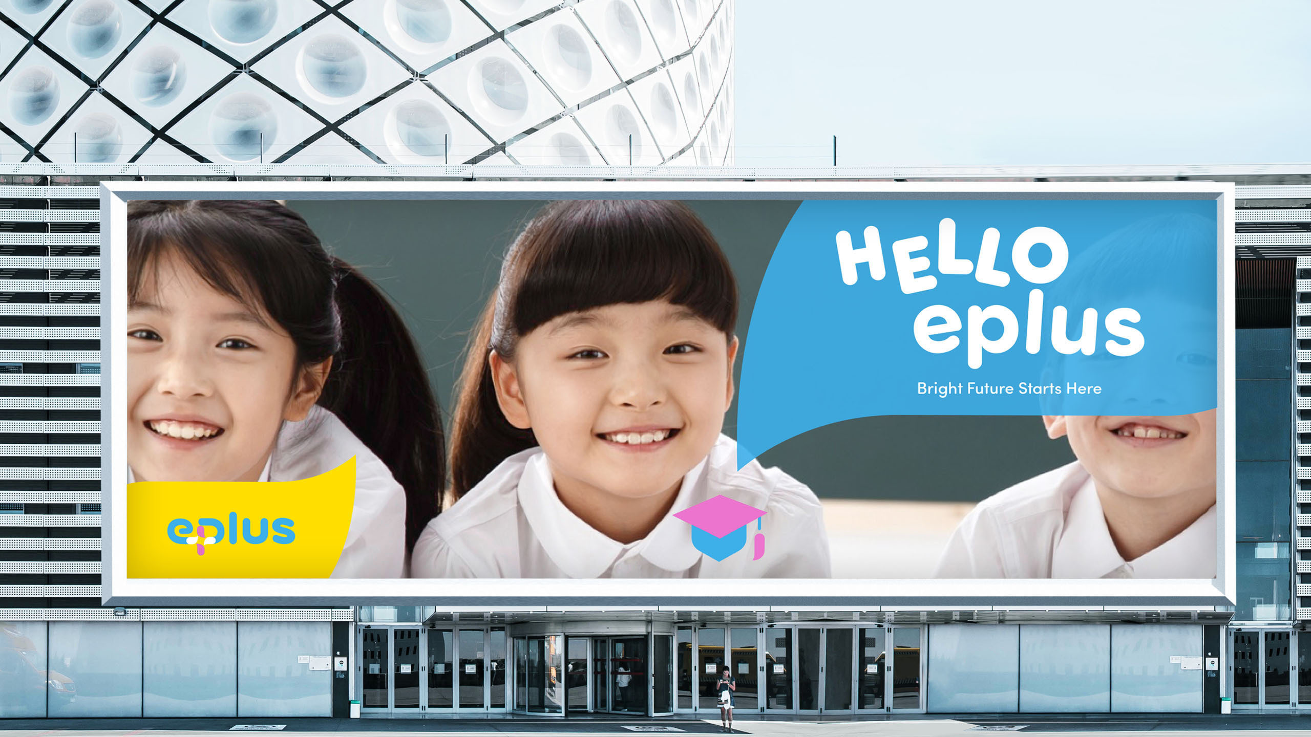
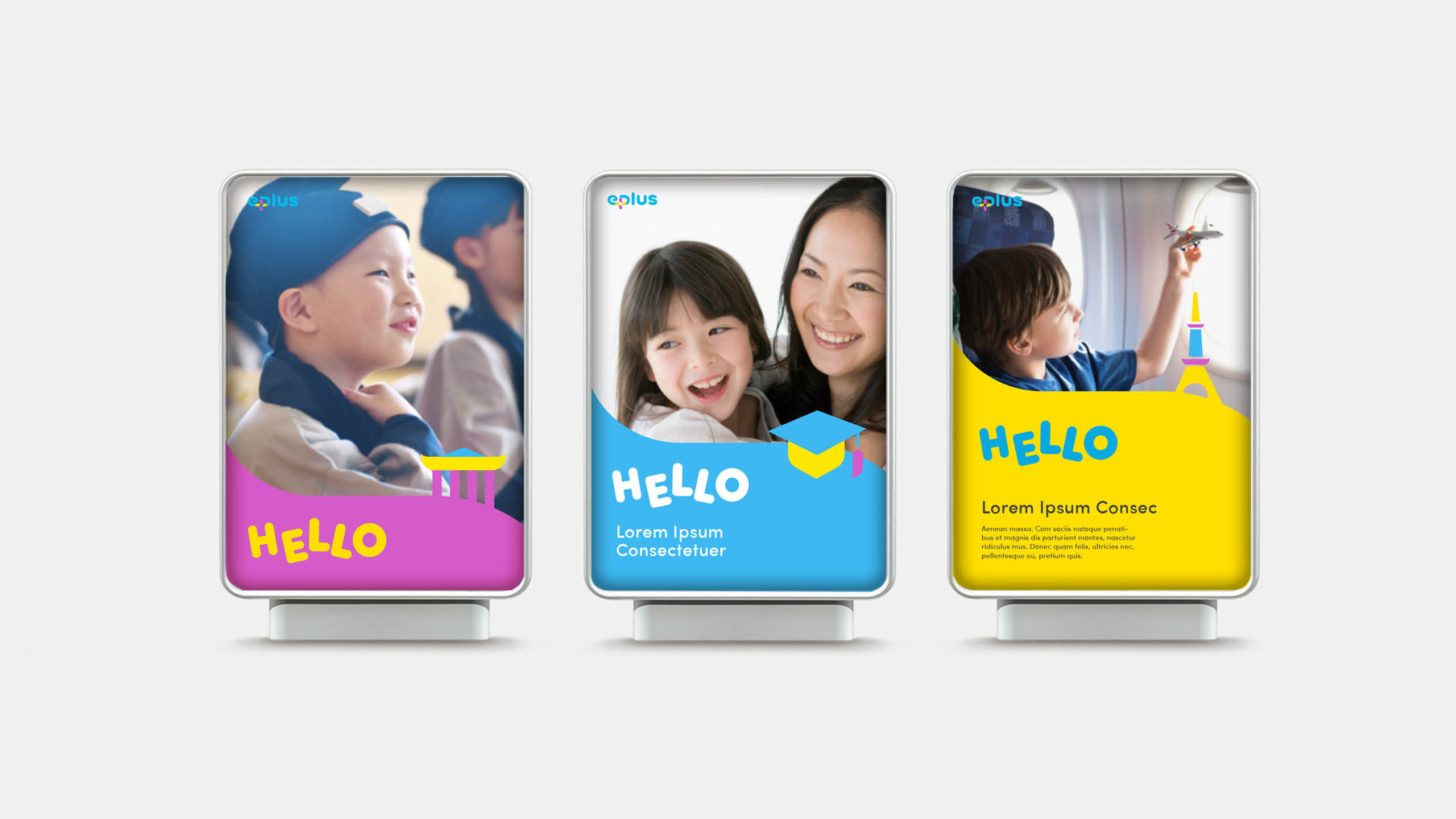
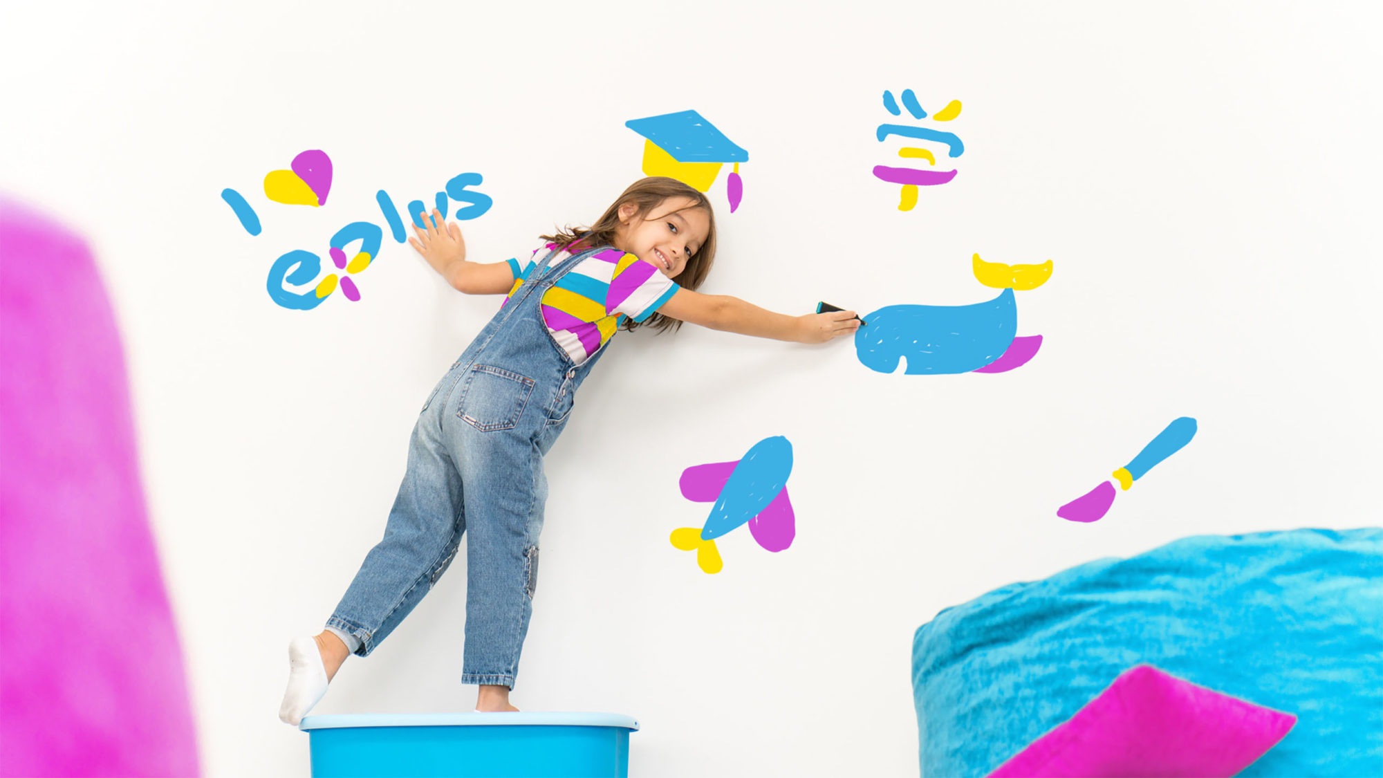
Although parents are the primary buyer of the service, it was children who would be powerful influencers and persuaders on the path to purchase.
FutureBrandʼs approach was about giving these children playful elements to interact with, within the visual system itself. Given the brand would be applied both in digital media and in physical spaces, we developed an E PLUS identity that came to life; inviting participation across channels, and communicating the role of sub-brands effectively.
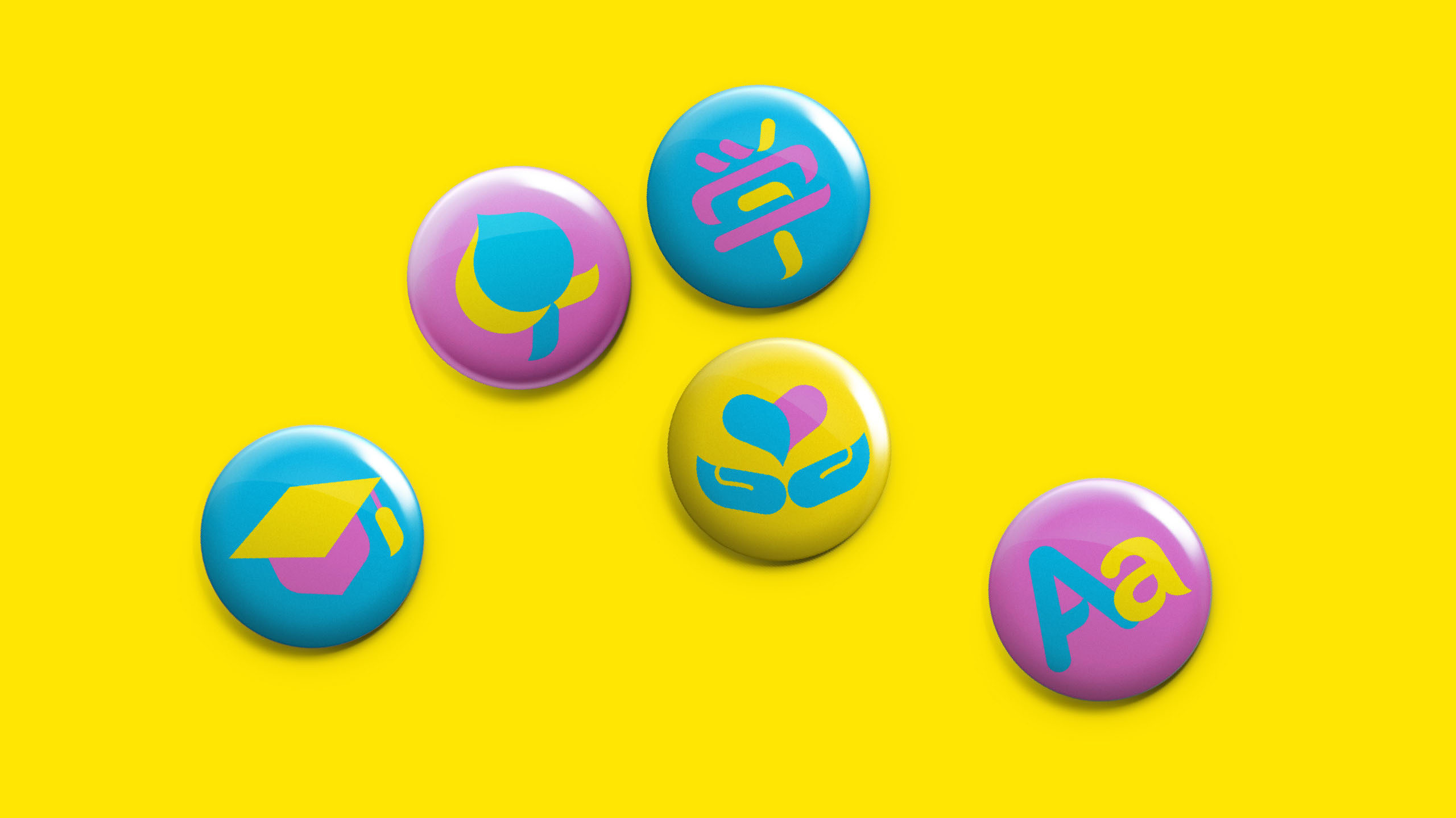
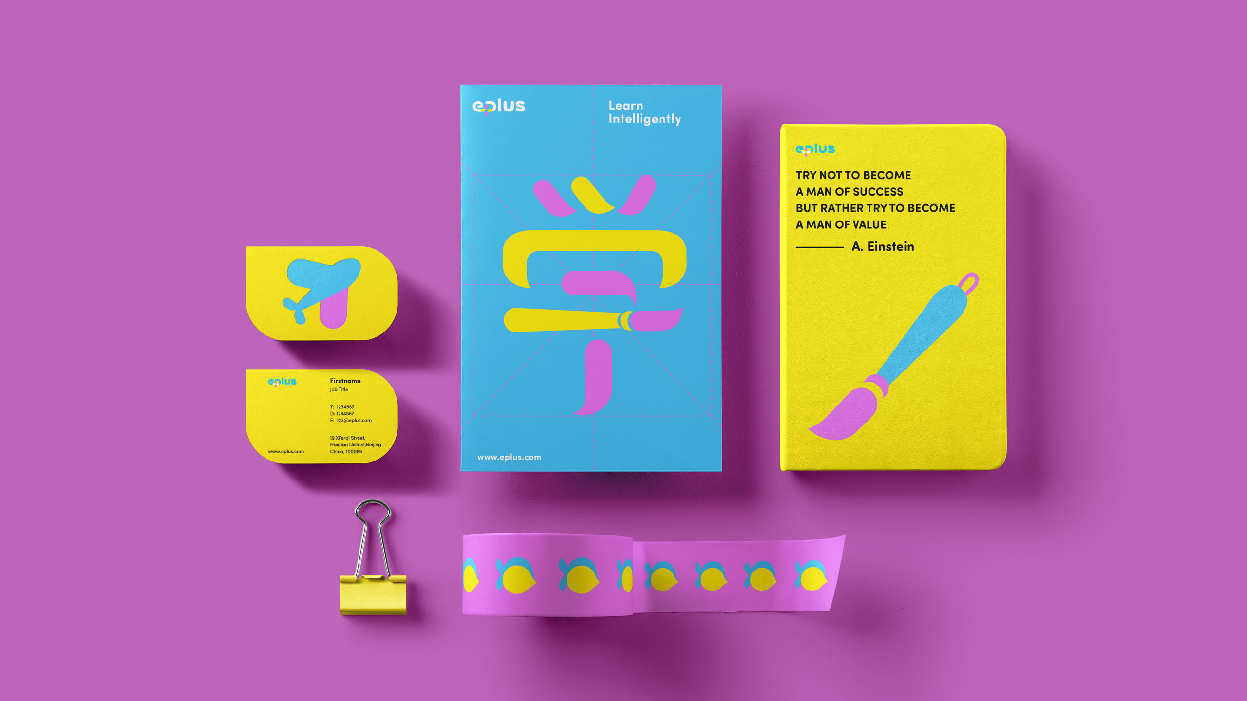
In creating the identity, FutureBrand used the symbol of the brushstroke as a potent metaphor for ‘teaching and learningʼ. It's the brushstroke that transfers knowledge and creates new knowledge.
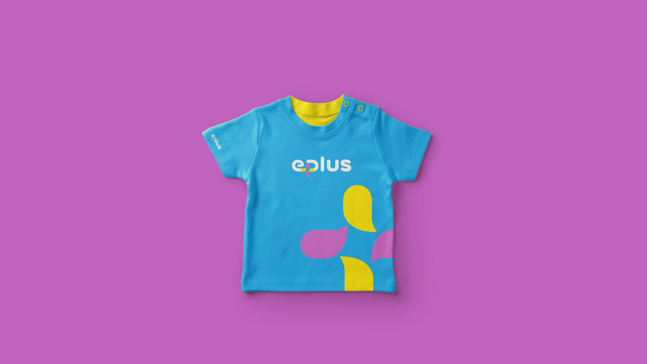
Four coloured brushes are arranged in a cross to create a windmill, itself symbolising the ‘plusʼ within the name. It communicates the depth of offerings and the story in the name, it is highly recognisable and reinforces perceptions of the service as a new, international approach to educational service provision.
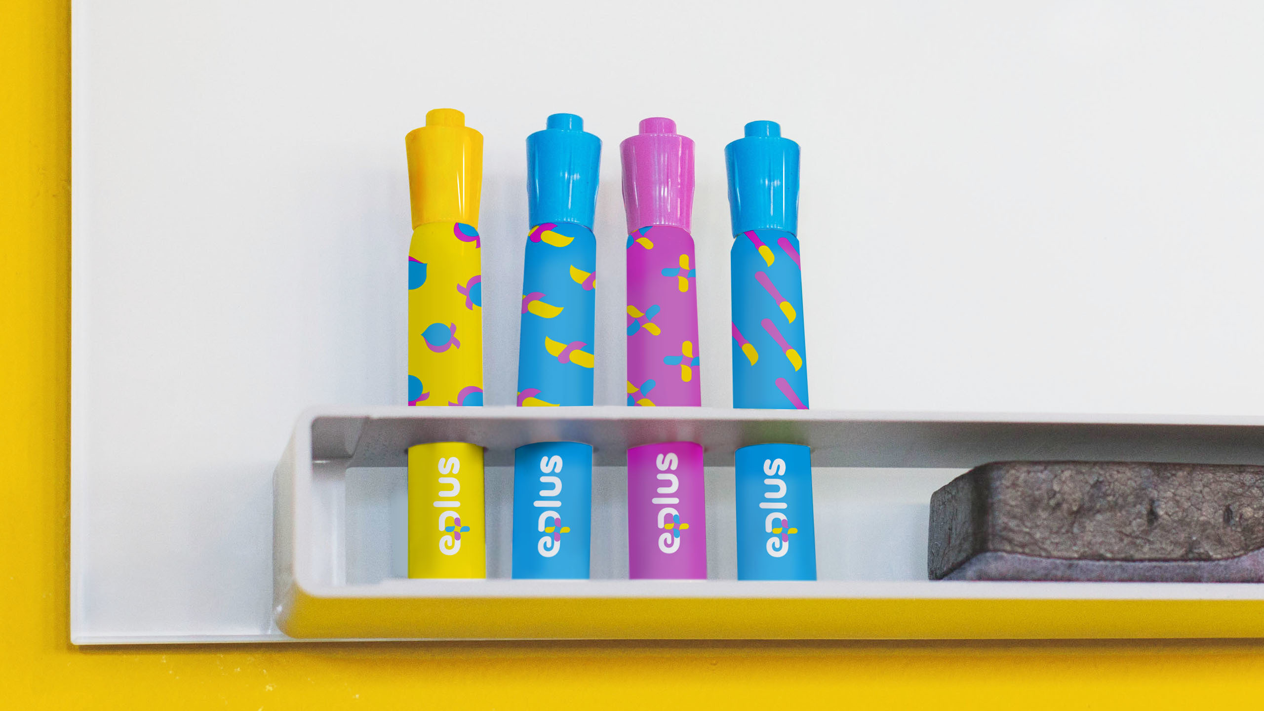
The brushstroke-and-plus device has been extended to a range of touchpoints to create a genuinely connected brand experience for children and their parents.
The creative concept and visual system has been applied to a wide range of internal and external touchpoints to support parents and children at every stage of the process.
The new visual system was set with overwhelming approval from the customer. More importantly, E PLUS has successfully delivered a brand experience with its service experience and its reputation for excellence as a leading global educational institutions for children, K-12 in China.