BP
A Beneficência Portuguesa de São Paulo
Introduction
A Beneficência Portuguesa de São Paulo used to be a traditional brand in the health segment. Despite of being well known, it needed to reinvent itself: exalting its qualities to make its communication more vibrant and effective.

Challenge
Creating a proprietary identity that could differentiate the brand from the other players, avoiding in the communication the use of clichés that are so current in the health area. Thus, turning the brand more humane, highlighting its main features and promoting a synergy among its sub-brands.
Solution
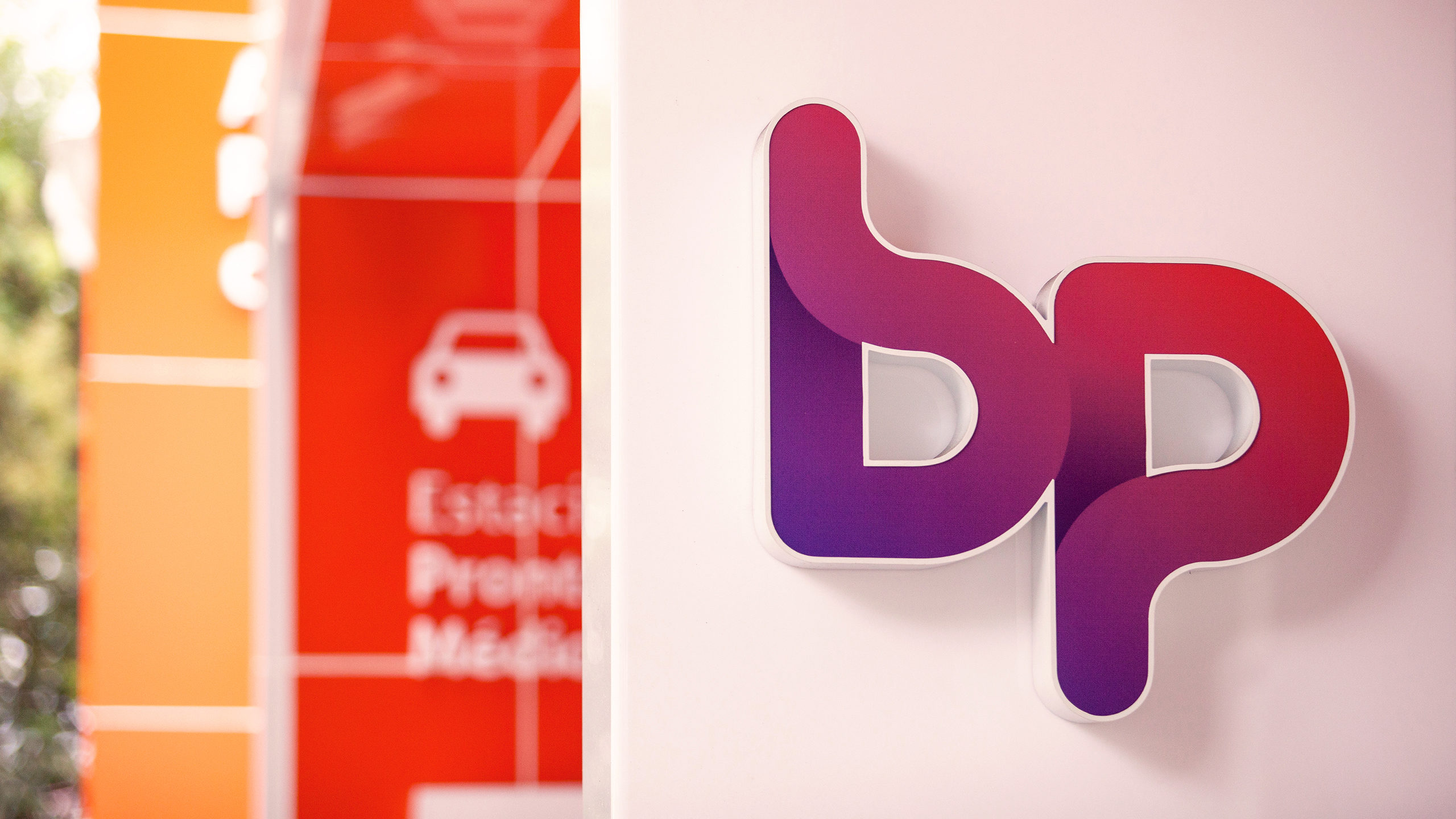
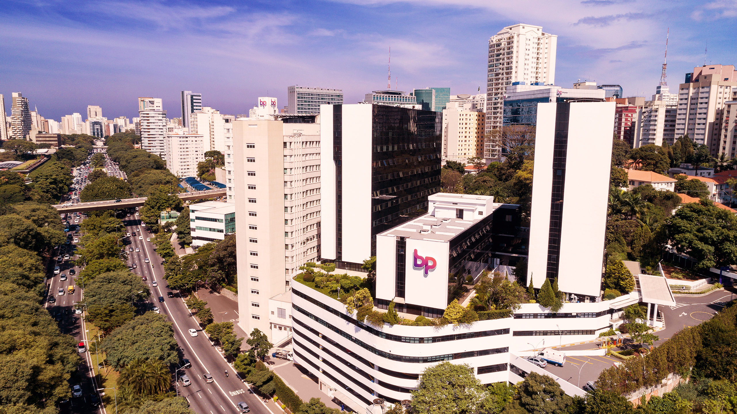
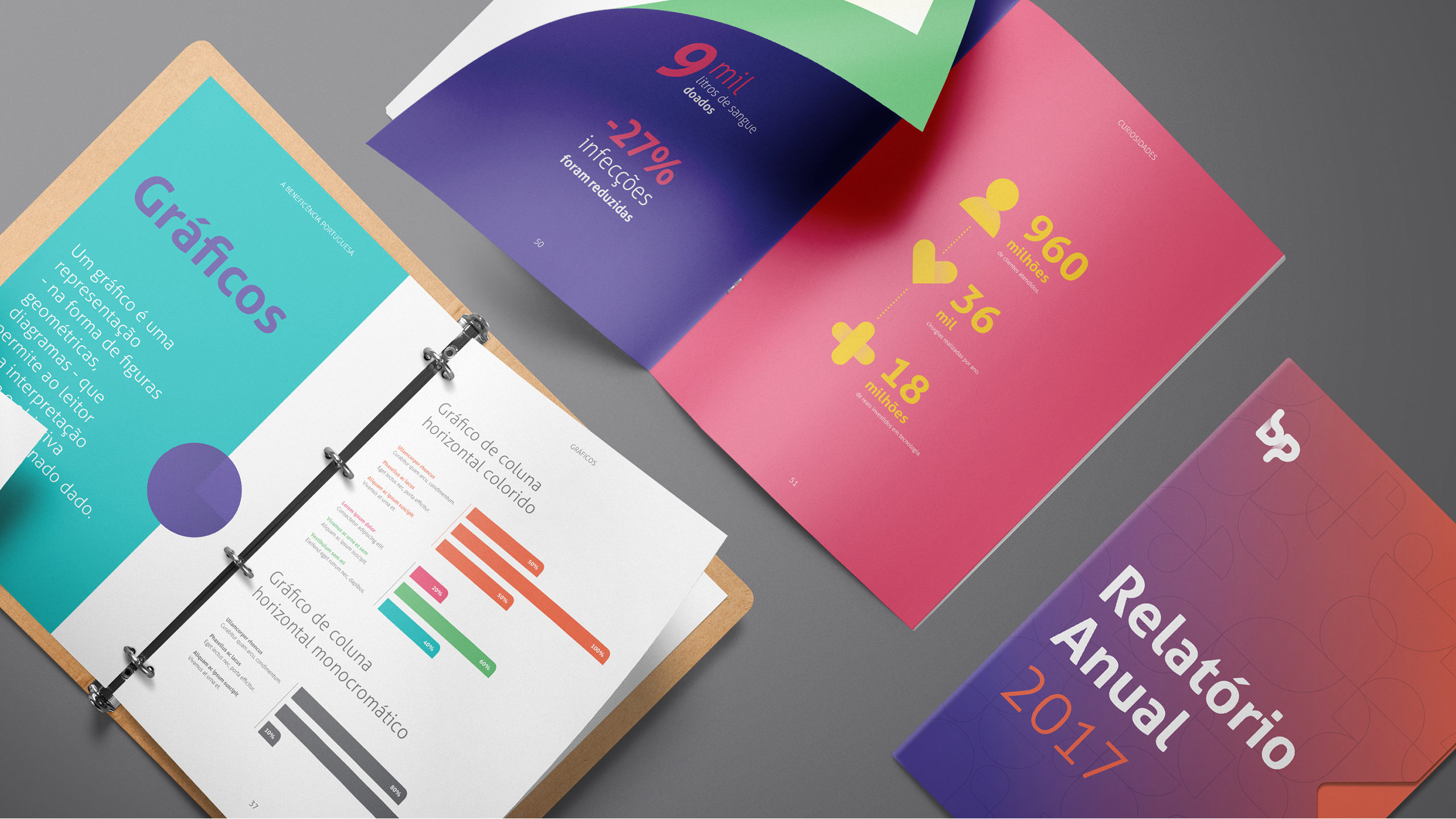
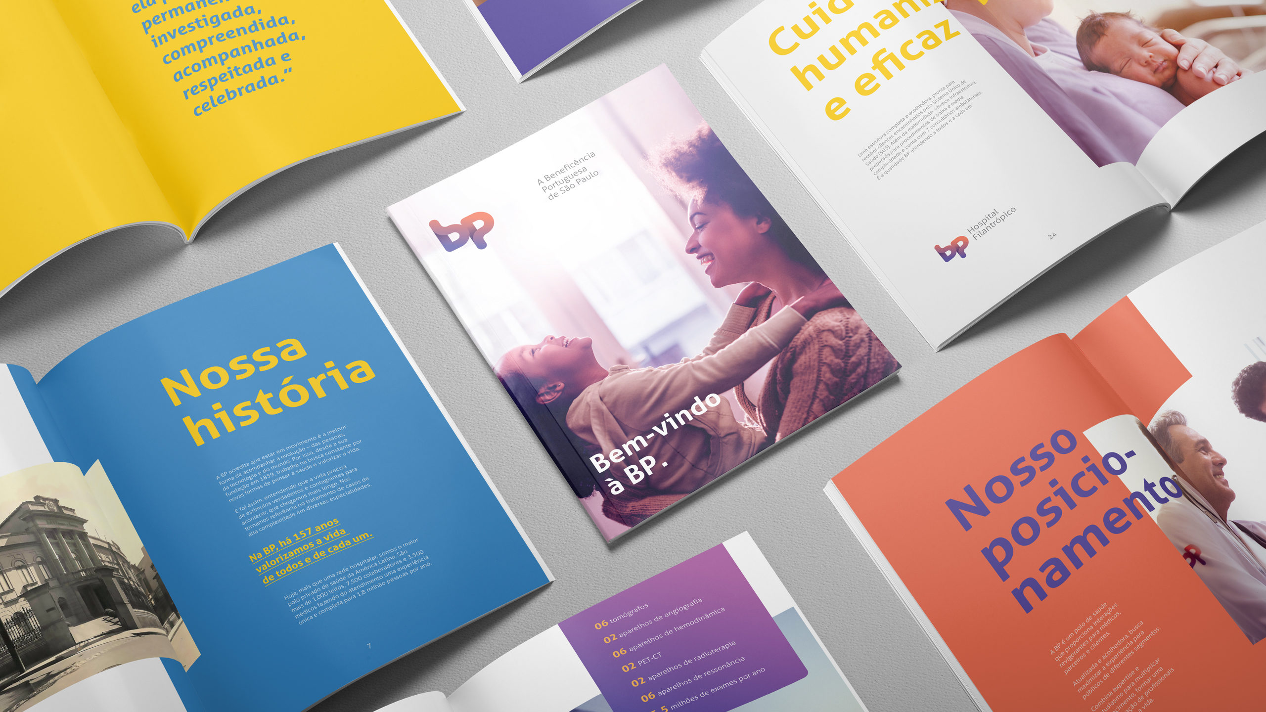
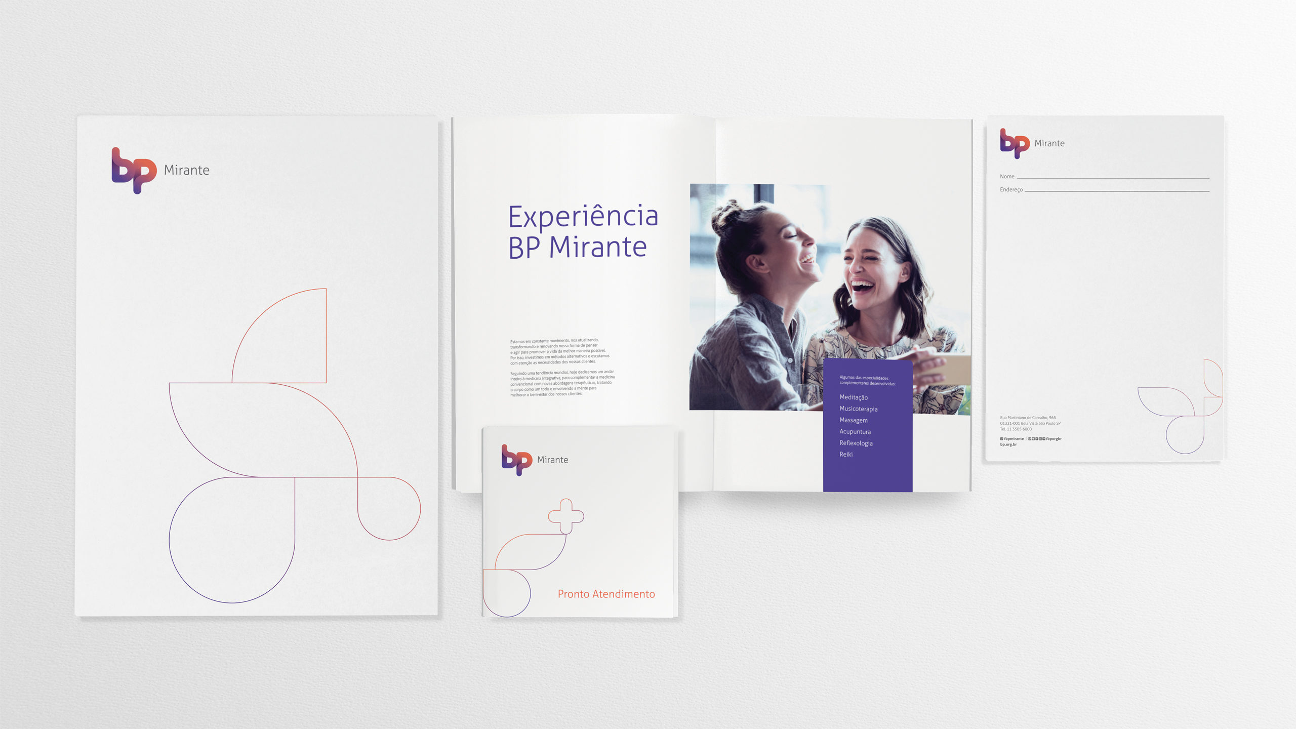
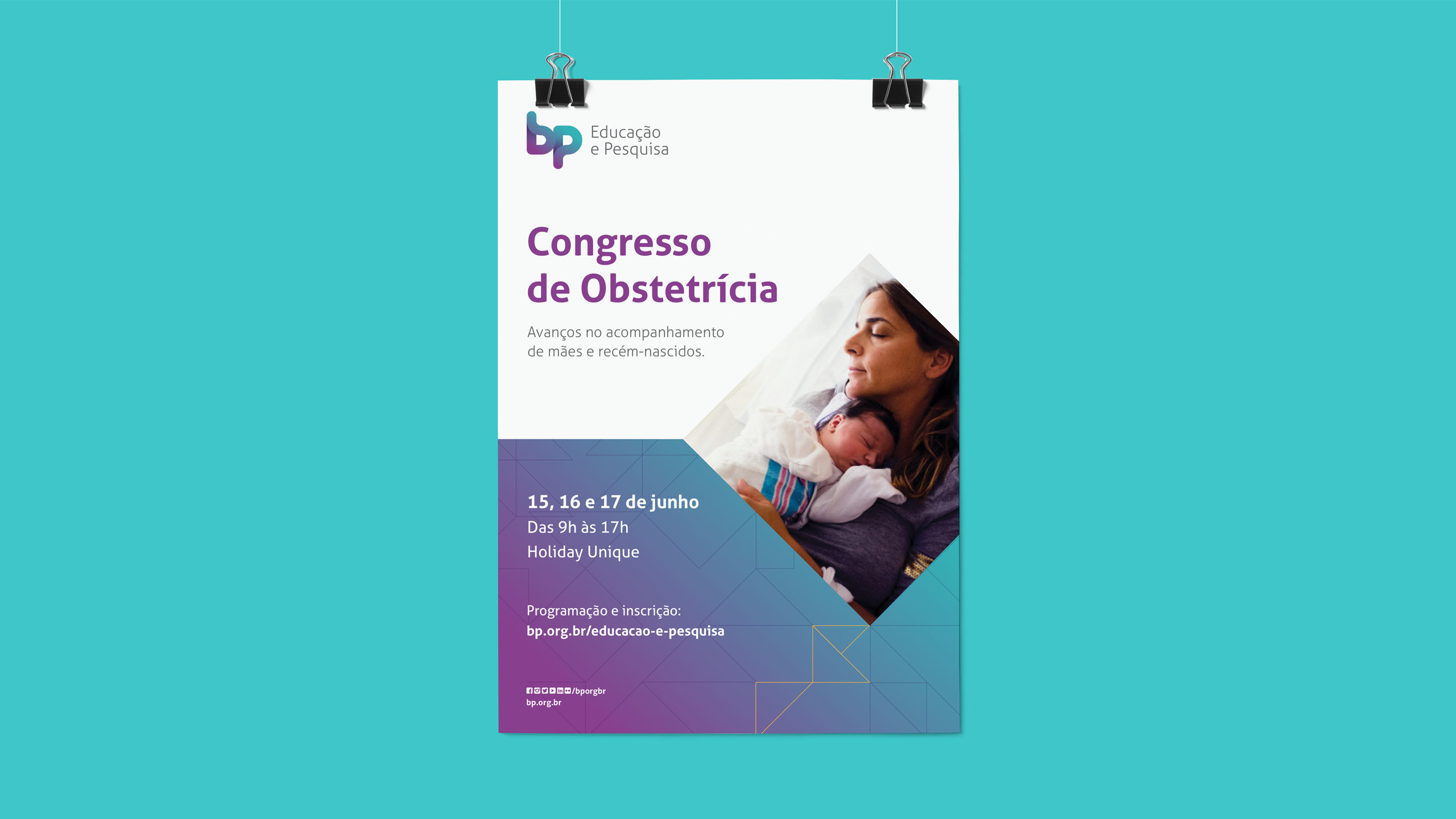
We changed the name to BP and reorganized all the brand architecture: a way of consolidating its positioning as a health center. This was the basis for the creation of a purpose and of values that inspire the culture of the institution.
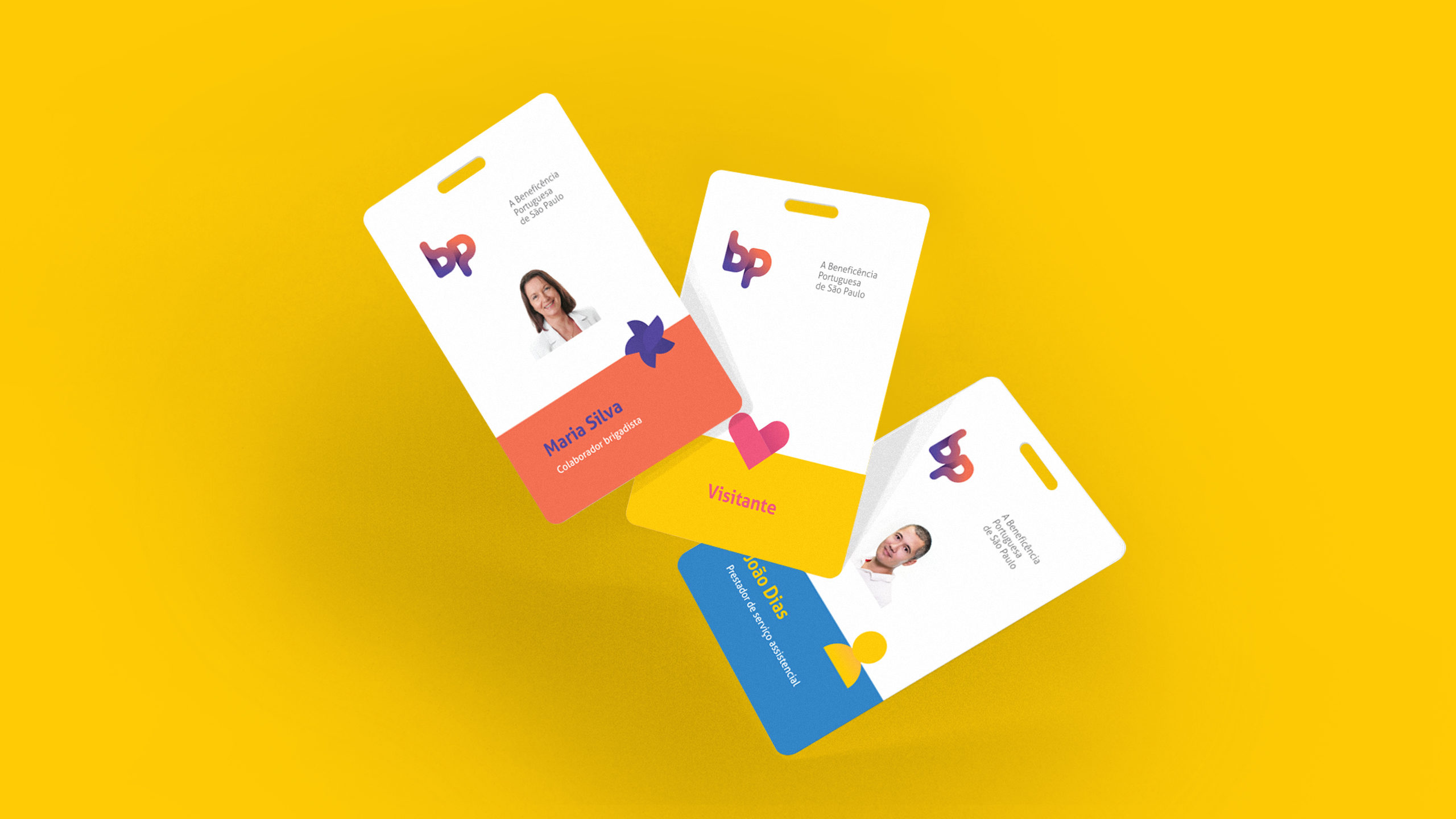
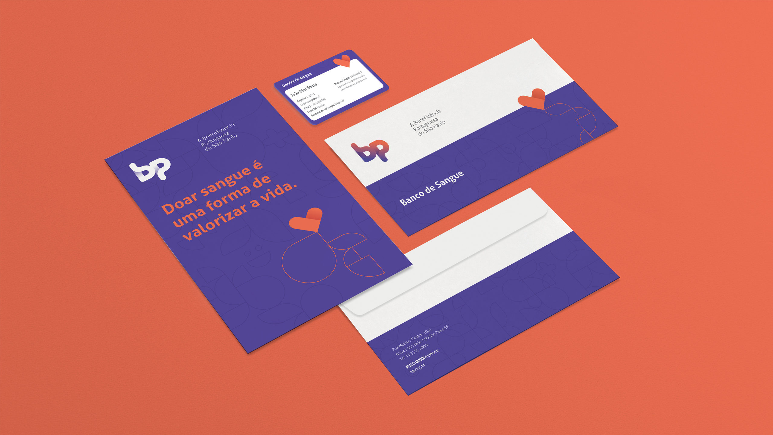
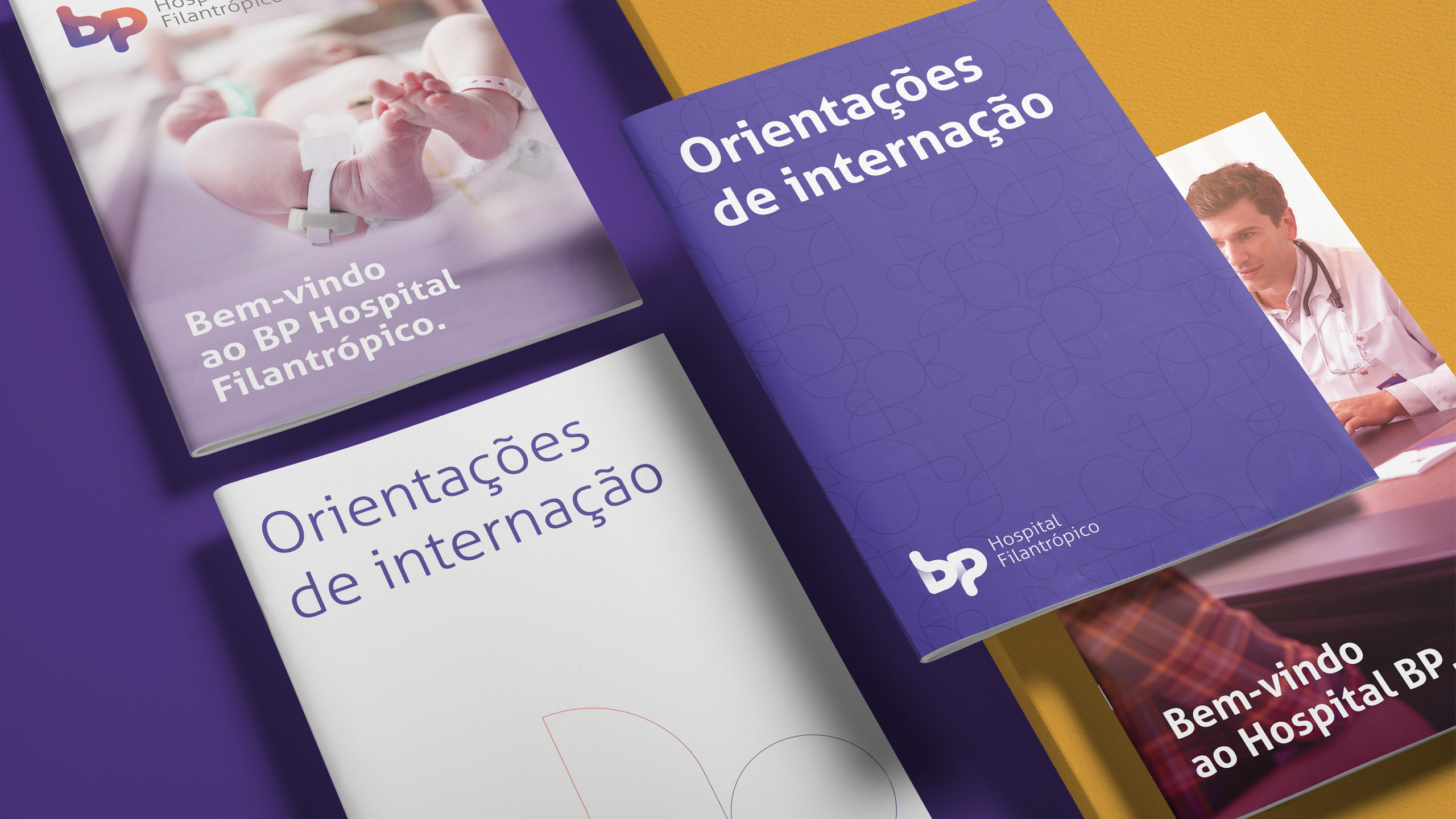
It was necessary to make the brand translate the personality of BP. Therefore, regarding the visual universe, we added even more vivacity and suggested a color palette that is little explored in the health sector. To the verbal identity, we brought a clear and inclusive tone of voice, capable of talking to every and each person.
Results
Now BP is a brand close to its customers, with the differential quality of offering a more welcoming experience in all touchpoints: from publicity to social media, and also in the institutional communication and service.