CH2M.com
将挑战转化为机遇
Challenge
What started out as a small regional engineering firm had grown to include 26,000 employees working in more than 50 countries, with annual revenues of almost $6 billion. But expansion left many employees unsure of what CH2M stood for—for a company built on its unique corporate culture, this diluted one of its greatest assets. Worse yet, inefficient integration of acquisitions and high turnover also left them unclear about what the company offered outside of their siloed specialty areas

Our Approach
We developed a design solution that conveys this levity and playfulness. The logo not only shuns the conventions of its peers with a bright suite of colour options, but also echoes the brand’s humanity with its expressiveness.

Design Development
Immediately, it was clear what makes CH2M HILL so special: its people and their values. So when we suggested a name change, we recommended going back to the original “CH2M” – to simplify without losing sight of these foundational values.
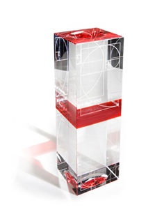
The visual system brings to life these core ideas. The new logo exemplifies humanity and expressiveness. And from a carefully curated color palette to a proprietary illustration style, every piece was selected to be functional while inspiring an emotional response.

Results
The rebrand is already working. Since launch, CH2M’s capture rate—a measure of incoming new business—is up markedly, from 40% in 2014 to 53% in the first quarter of 2015. Partnerships with one of its key clients have also increased significantly. And in the first 17 days after the new website went live, it received 414,684 page views—3 times the views the old site had during its last 17 days, a trend that continued throughout until the present day.

Awards