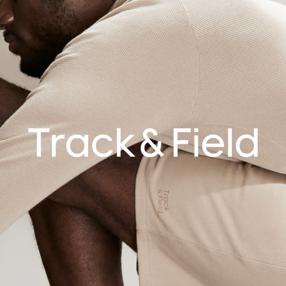
Track&Field
A new relationship between people and sports
更多详细信息
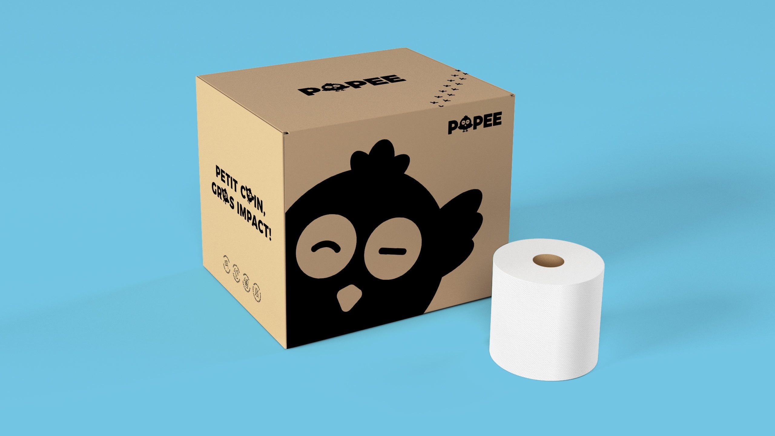
A small chick for big impact
Popee is a recycled toilet paper business launched by Audrey Destang, a French entrepreneur involved in the “French tech” community.
Convinced Digital Native Vertical Brands embody the future of ageing businesses, creating an eco-responsible and eco-conceived toilet paper business uniquely sold online. Produced with recycled paper in Normandy, Popee toilet paper is 100% French sourced and made.
FutureBrand's challenge was to help Popee emerge as a credible actor in an overcrowded and “basic” product category dominated by well-established and powerful international brands.

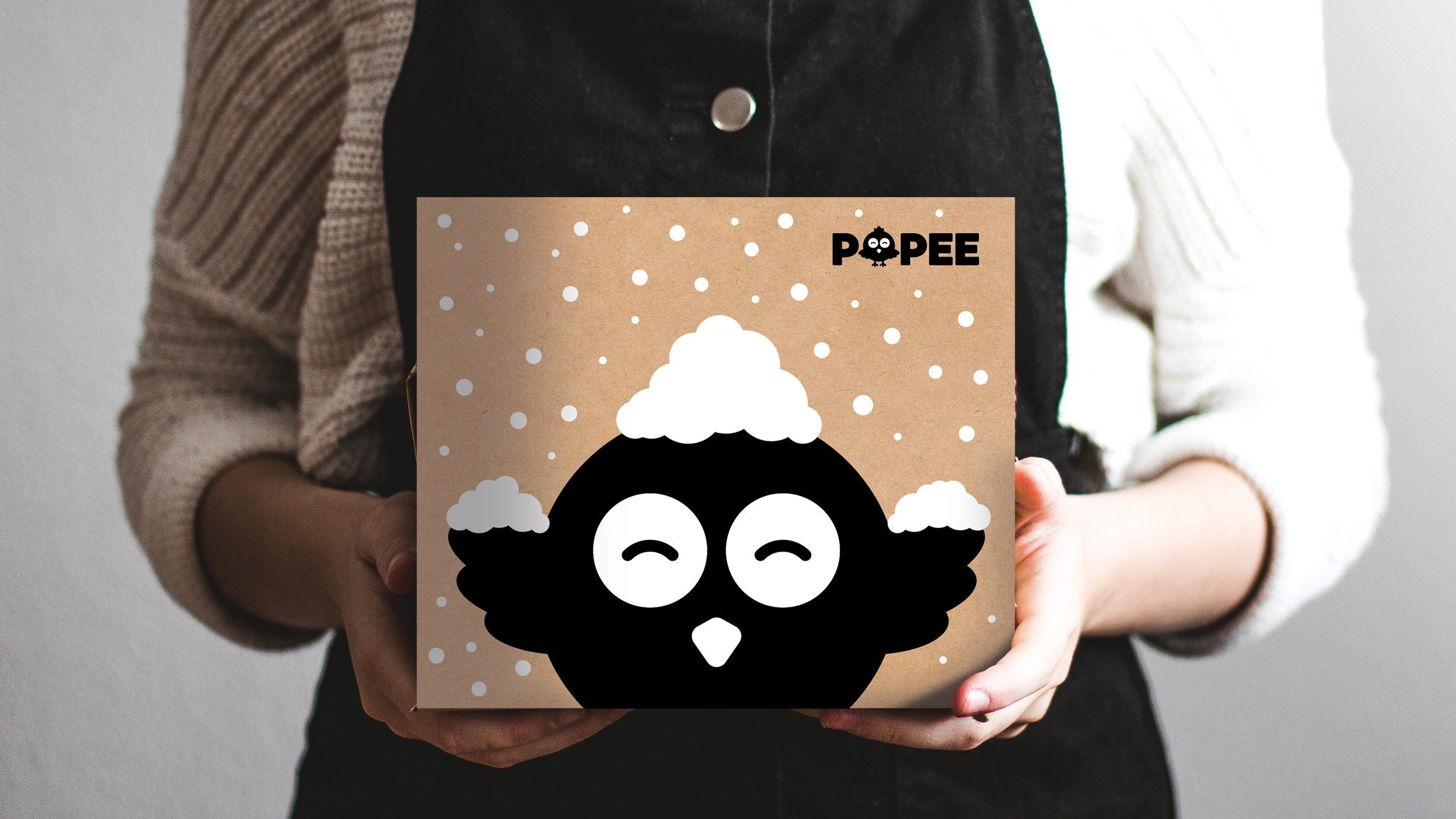
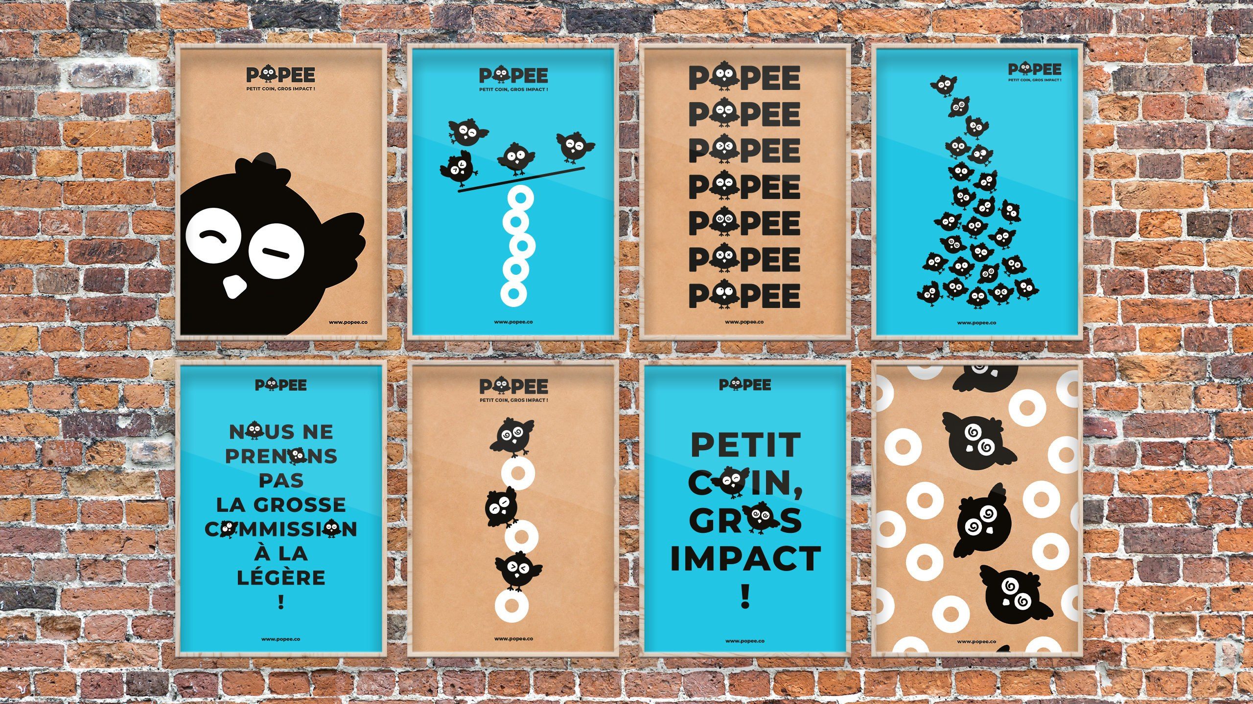
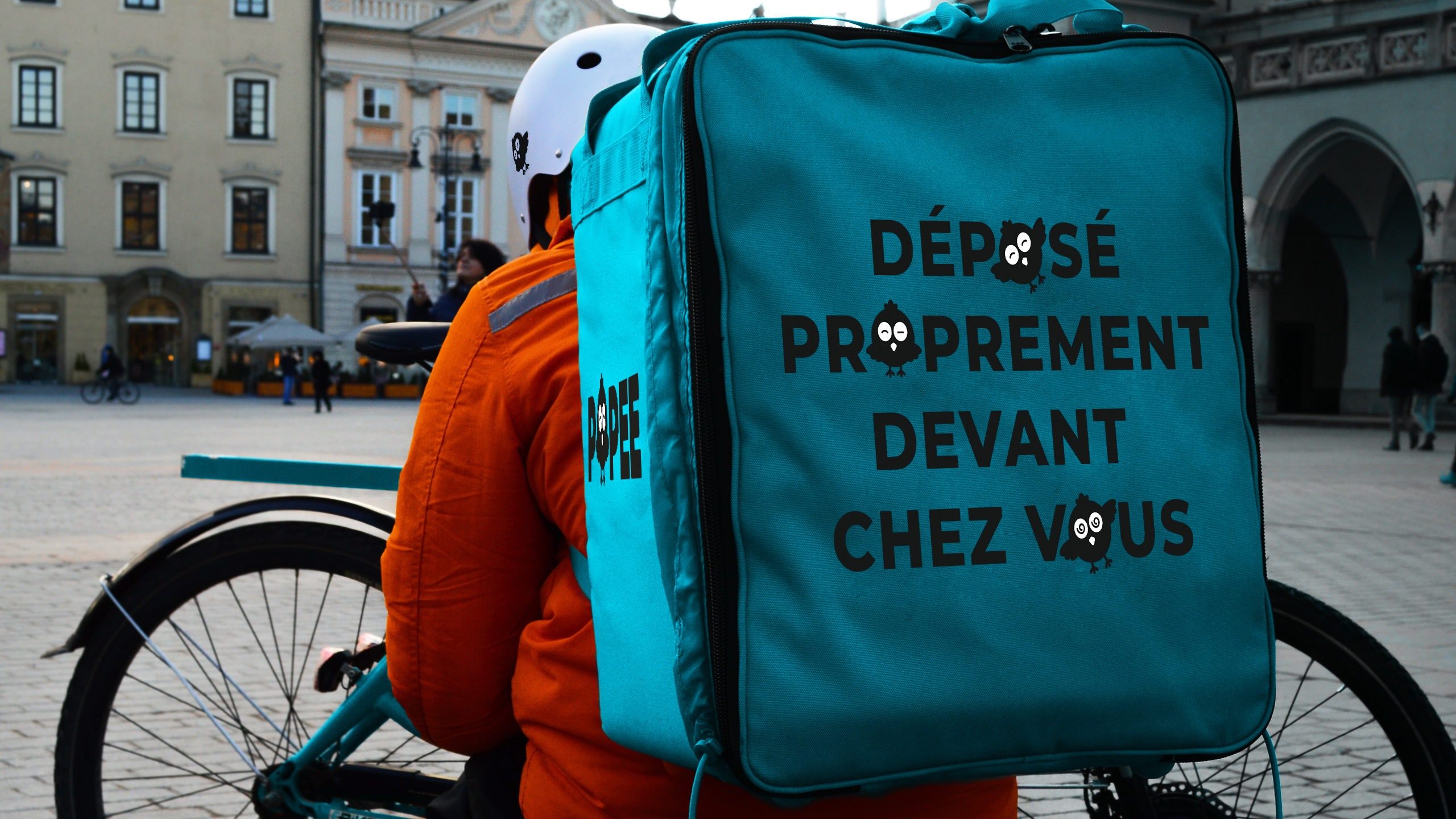
Thanks to our literature research inspired by Francois Rabelais’ Pantagruel story, we embodied Popee into a witty chick that would epitomise the brand at each step of the consumer journey.
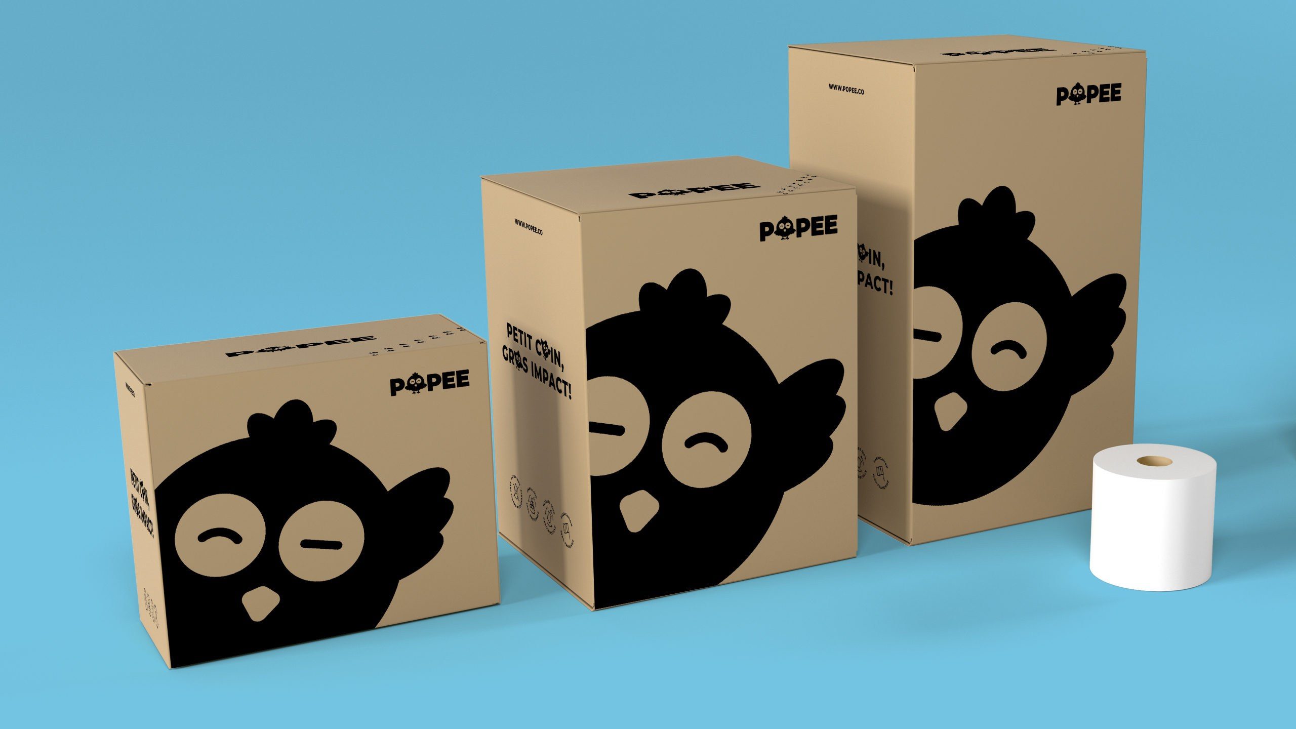
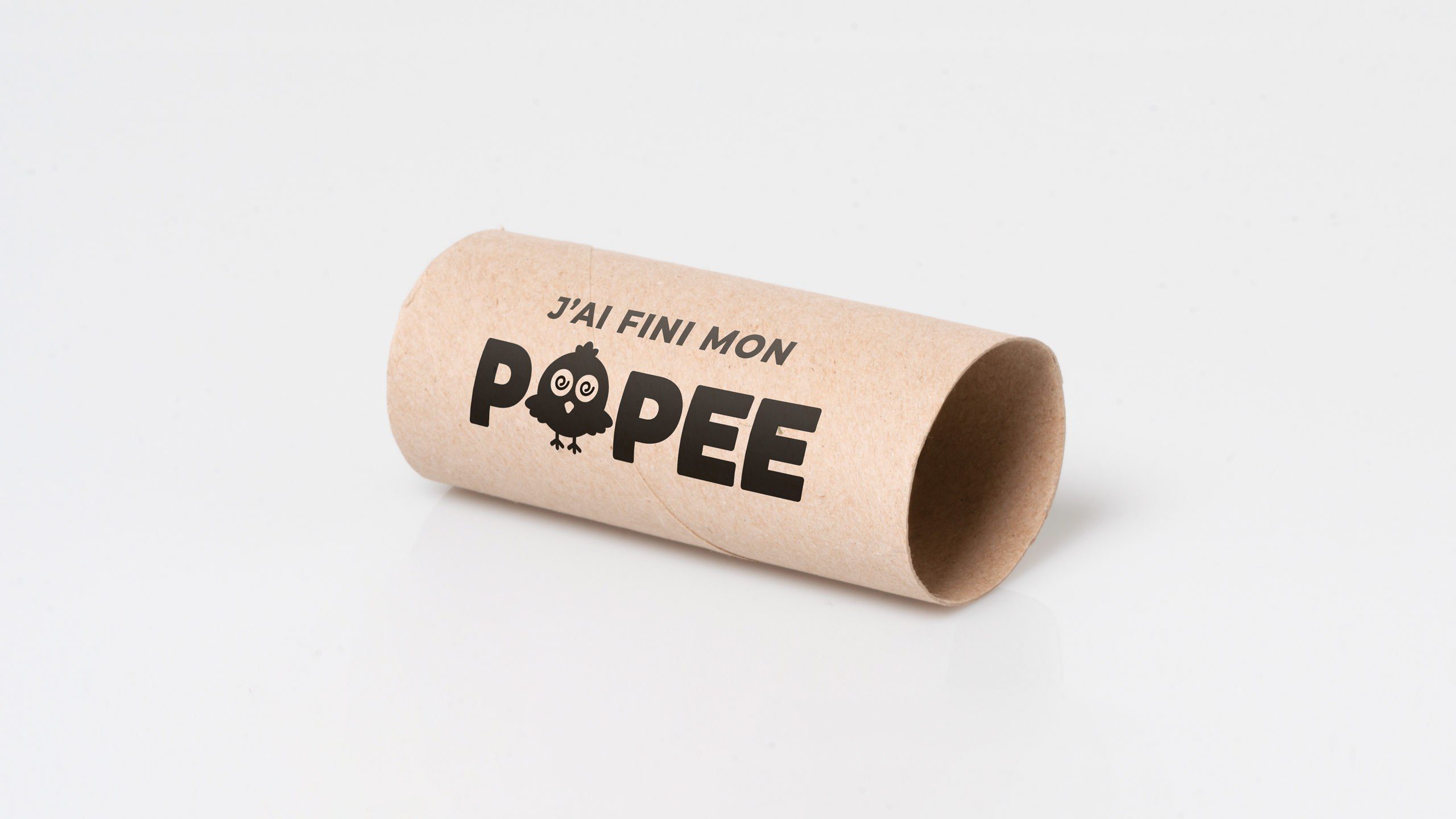
With a voluntarily simplistic yet very own-able and contemporary design approach, we pay tribute to the transparent and low impact product that Popee epitomises. The roundish, positive and fluffy composure given to the bird were introduced to bring charm, personality and reassurance to the brand. The Popee mascot was used in the brand name and ultimately adapted to each touch point we created, giving it expressions and attitudes that would trigger an emotional bond with the consumer.
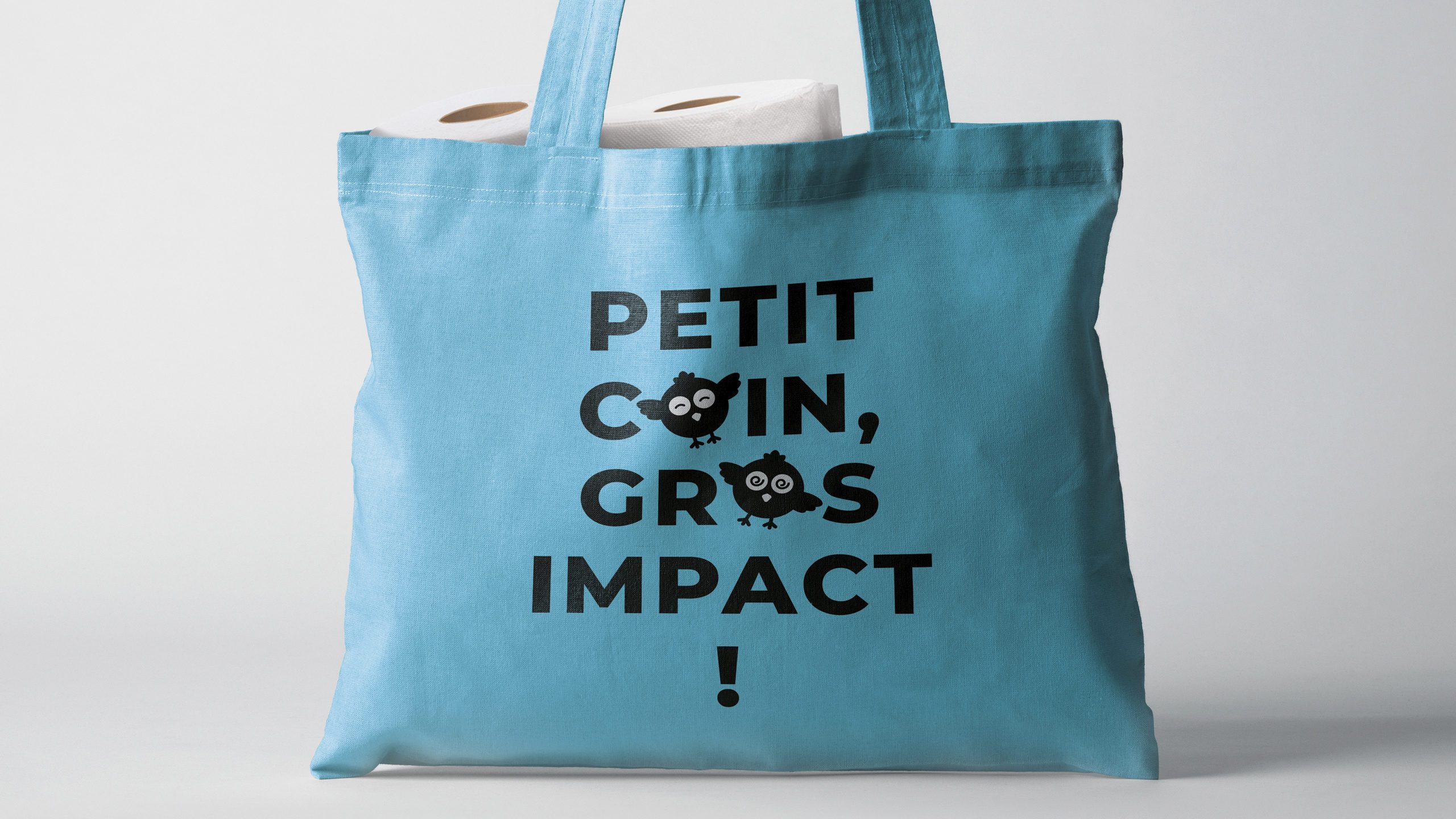
In order to deploy the brand across all packaging and to stay coherent with our simple, honest and eco-responsible approach, we deployed a single pack design adapted to the different toilet paper quantities and recycled cardboard sizes. Using the least colours possible, we chose to use only black for a slick and cheerful design. To balance and disrupt from the ‘pink’ and ‘white’ mainstream toilet paper brand universe we adopted a complementary bright and energetic blue colour to break the existing industry codes.
Awards ; Shortlisted for Pentawards 2020.